I built a fictional asset manager, Coldbrook Capital, and every deliverable it needs. A design system, a monthly fund report, a website and a brand film, all from one system, driven by Claude Code and Claude Design. This page explains how the pieces fit together and gives the exact prompts, verbatim.
Everything here is totally fictional, built as a design exercise. Coldbrook Capital is an active equity manager, and it helps to be clear what that means before the deliverables make sense. An active manager does not buy the whole market. It researches a large universe of companies, picks a concentrated set it believes are the best, in Coldbrook's case 25 to 35 quality businesses, holds them for years, and is judged on whether it beats a benchmark like the S&P 500. A passive index fund, by contrast, simply owns everything and matches the market. The report, the website and the factsheet all exist to explain and evidence that active bet.
Active management: research the universe, hold a concentrated set of the best, and try to beat the index.
I set out to build the whole thing in one sitting. Not a mockup of one screen, the full set a real manager ships: a brand, a monthly factsheet, a public website, a flagship report, and a short brand film. The thing that usually kills this is consistency. Build it across five tools and everything drifts off brand. So it all runs on one design system, defined once at the start, and everything after it inherits that system automatically.
The whole build kit, the design system as real code, the exact prompts, the built report and the brand film, is public on GitHub: github.com/davidalmeida90/claude-design-fund.
Claude Design is Anthropic's design surface inside Claude. You describe what you want and Claude generates real, editable design work: documents, slides, wireframes, UI mockups, and full websites, not just a flat picture of one.
The difference that matters for finance is that Claude both writes the content and designs it, in the same place. When you hand it a design system, it already knows your brand, so the report, the site and the film all come out matching instead of drifting the way a generic image tool does.
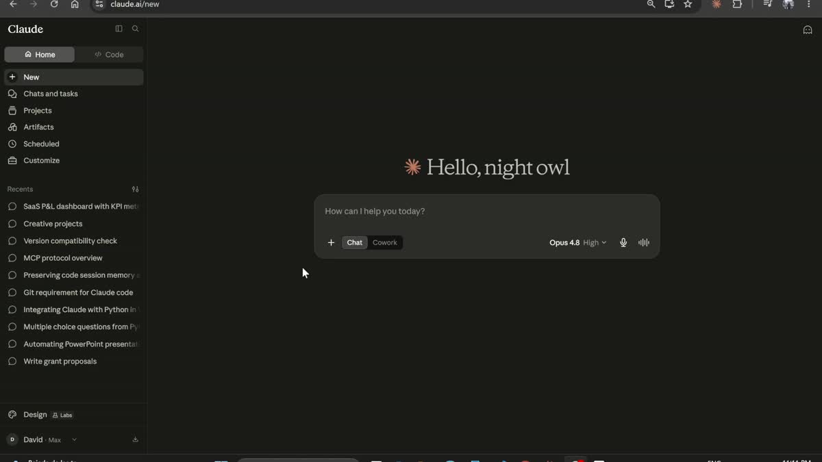
Claude Design. You describe the deliverable, point it at a design system, and it builds real editable work.
This is the whole idea. You define the brand once as a design system: the exact colours, the typefaces, the logo, and a set of components like the stat rail, the data table and the chart panels. From then on, every artifact is built with that system selected, so the report, the website, the factsheet and the brand film all inherit the same navy, the same type and the same chart styles. Nothing is re-described, so nothing drifts.
Define the brand once. Every output inherits the same tokens, so nothing drifts off brand.
Claude Code writes the design system as real code on disk, and it is packaged as a reusable Claude skill: a SKILL.md that tells Claude how to use it, the written brand spec, and the tokens plus one preview per component. That skill is the whole reusable core, and it is public on GitHub. This is its layout.
| fund-design-system/ | the reusable Claude skill, public on GitHub |
| SKILL.md | what the skill is and how to use it with /design-sync |
| coldbrook-brand.md | the written brand spec, the source of truth |
| ds/ | the design system, as real code |
| colors_and_type.css | every colour and type value as CSS variables |
| preview/ | one small HTML preview per component, each an @dsCard |
The design system packaged as a Claude skill. Drop it into ~/.claude/skills/, run /design-sync, and build. It is on GitHub.
To get the design system out of your files and into Claude Design you run the Claude Code skill /design-sync. It is worth understanding, because without it the tokens never reach Claude Design at all.
/design-sync takes a local folder that holds one tokens CSS file, with every colour and type value written as CSS variables, plus one small self-contained preview HTML file per component. Each preview file carries a <!-- @dsCard group="..." name="..." --> comment on its second line, which is what makes it show up as a card in the Design System pane. The skill pushes that whole folder up to claude.ai/design as a named Design System project. Once it syncs, you select that project in the Design system picker on the composer before building anything else. The picker defaults to None and reverts after a page refresh, which is the single easiest thing in the whole build to forget.
The upshot is that the brand lives as code you own, and revising it is one component at a time. You do not re-prompt the whole system, you edit the file in ds/ and run /design-sync again, so nothing else moves.
Competitor reports are useful for structure, never for style. Nothing from another manager goes into the design system, or Claude absorbs their palette and type. Reference pages go into the individual artifact prompt instead, always with this line: use the attached reference for structure, section order and information density only, do not copy its colours, typefaces or visual style, all styling comes from the Coldbrook design system.
This is the part that separates a real institutional report from something that just looks AI generated, and it is worth as much attention as the prompts. The whole Coldbrook report is a format ported from real fund reporting, so the quality comes from studying how real managers actually present, not from a blank prompt. Build a small library of reference pages first, then attach the right one to each artifact.
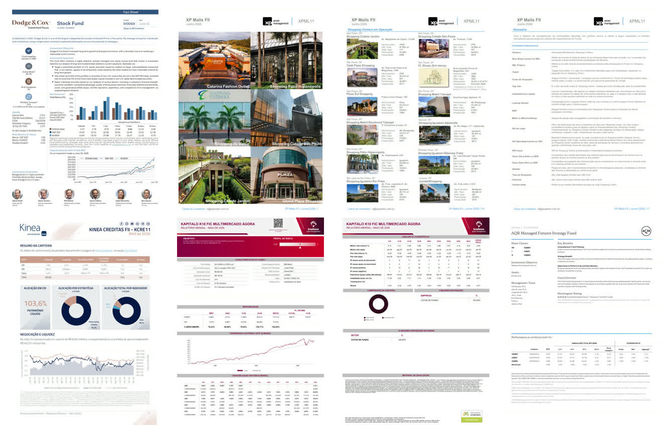
A reference wall of real fund reports: Dodge and Cox, XP Malls, Kinea, Kapitalo, AQR. You study how they present, then borrow the structure, never the styling.
A few ways to gather it, roughly in order of effort:
The easiest of all is to let Claude do the legwork. Point it at a manager and ask it to find the latest monthly report, read it, and describe the layout page by page: where the fund information sits, how the performance page is ordered, whether there is a glossary. Ask it to look at four or five managers and tell you which structure is worth copying, then have it save the pages you want. From inside Claude Code it can drive a headless browser directly, open each fund page and write out a full-page screenshot or a print-to-PDF, so the reference wall builds itself.
Claude can drive a headless browser to collect and screenshot references at scale.
Then apply the one rule above: references go into the individual artifact prompt for structure and density only, never into the design system, so you borrow the layout without inheriting anyone else's brand.
These are the exact prompts behind each deliverable, verbatim from the build kit, in build order. Swap in your own brand, colours and content and they carry straight over. Placeholders in square brackets are where the fund facts and the reference rule get pasted in.
Every other artifact quotes these entities, tickers and legal terms, so they are pinned down once at the start. Getting them consistent is what stops the report, the site and the factsheet from disagreeing with each other.
Fund: Coldbrook Focused Equity Fund, Class I, ticker CBFIX, CUSIP 19752K104.
A series of Coldbrook Funds Trust, a Delaware statutory trust.
Adviser: Coldbrook Capital Management, LLC, Boston MA.
Distributor: Fairmount Fund Distributors, LLC (unaffiliated with the Adviser).
Administrator, fund accountant and transfer agent: Corbin Fund Services, LLC.
Custodian: Merrimack Trust Company, N.A.
Independent registered public accounting firm: Whitlock & Reese LLP.
Legal counsel: Carrow & Bain LLP.
Inception 3 March 2016. Fiscal year end 31 October. Benchmark S&P 500, secondary
Russell 1000. Management fee 0.65%. Gross expense ratio 0.83%, net 0.72% under a
contractual expense limitation through 28 February 2029. No 12b-1 on Class I.
Minimum $100,000. Distributions paid annually. 25 to 35 holdings. $1.84bn net assets.
Everything is fictional and every page says so.Everything else rests on this, and building the design system straight in Claude Code is the recommended route by far. The on-camera Create-here form further down works in a pinch, but having Claude Code read the brand off real files and write real tokens gives far more control and consistency than describing a brand in a text box. It writes the system as real code, tokens plus one preview per component, which /design-sync then pushes into Claude Design. Exact hex codes and a named typeface stop Claude from guessing, and the long "never do" list is what keeps every later output from looking AI generated. After it builds, run /design-sync and select the Coldbrook Capital system in the composer.
Build a design system for my fund and push it into Claude Design with design sync.

The firm is Coldbrook Capital, a US active equity manager running one concentrated
portfolio of 25 to 35 quality businesses. Institutional and restrained, print-first,
modelled on a dense monthly fund report rather than a SaaS landing page. It has to work as
a printed US Letter PDF and as a website, and survive being printed in black and white.

Build it as real code so design sync can push it. Write one tokens CSS file with every
colour and type value as CSS variables, and one small self-contained preview HTML file per
component, each starting with a <!-- @dsCard group="..." name="..." --> comment on line
two so it shows up as a card in the Design System pane. Then push the whole folder to Claude
Design as a new design system project called "Coldbrook Capital" using design sync, and tell
me the project name so I can select it.

COLOUR. Two colours carry the system. Deep navy #0C1E48 for authority: headings, the stat
rail, the first data series, the logo. Muted clay #C08878 for emphasis: the period, table
header bands, the second data series, buttons, the one big number on a page. Supporting:
navy-deep #061842, navy-soft #24365A for a panel ribbon, clay-tint #E8D2C9 for table row
banding, blush #F2EBE5 for quiet panels, panel grey #E4EAEA for chart backgrounds, slate
#7E8A9C for secondary text and axis labels, hairline #D4DBE0 for rules, a muted gold #A8935F
for a dashed reference line. No red and green anywhere: direction comes from navy against
clay, parentheses on negatives, and position on a zero axis.

TYPE. A humanist sans throughout, Source Sans 3, no serif anywhere. Tabular lining numerals
everywhere with no exceptions. Two scales, print in points down to a 6.5pt disclaimer and
web in rem. Body copy justified. Section heads all caps navy semibold, no rule, no box.

LOGO. Three horizontal bars of unequal length, slightly offset, the middle bar in clay and
the outer two in navy, reading as moving water and a bar chart. Deliver the mark, wordmark,
horizontal lockup, a reversed version, and a favicon that holds at 16 pixels.

COMPONENTS to build as cards: core palette, type scale, logo, the running header and footer
with a pale clay diagonal ribbon, the navy stat rail with a diagonal ribbon and pale caps
labels over large white values, the blush fact strip, a data table with a clay header band
and no zebra striping, a description table with a grey label column and a justified
description column, an activity table with the action word as small-caps text, a holdings
and valuation table, chart panels in flat grey, the monthly return grid, diverging
contribution bars, an underwater drawdown, labelled horizontal bars, and a multi-line chart
with the values printed on the marks.

NEVER, because these are the tells that make finance design look AI-generated: no rounded
corners, no drop shadows, no gradients as decoration, no three-up equal card grids, no
icons, no centred body text, no pill tags or coloured status badges, and no card with a
coloured stat sidebar. Actions and holdings are tables. If two blocks need separating, use a
section head, a hairline rule and whitespace, never a box.
If you would rather generate the system live on camera instead of pushing it with the skill, Claude Design has a Create here form with two text fields. This is what goes in them.
Company name and blurb:
Coldbrook Capital: US active equity manager running a concentrated portfolio of 25 to 35
quality businesses. Publishes a 10-page monthly fund report and a quarterly factsheet as
printed US Letter PDFs, plus a website for institutional allocators with strategy pages,
a document library and an investor portal.

Any other notes:
Institutional and print first. The reference is a Brazilian fund report: dense, two
colours in tension, nothing decorative. Everything has to work as a printed US Letter PDF
and as a website, and everything must survive being printed in black and white.

Two colours carry the whole system. Deep navy #0A1B3D carries authority: headings, the
stat rail, the first data series, the logo. Muted clay #C08878 carries emphasis: the
period label, table header bands, the second data series, buttons, and the one big number
on a page. Supporting values are navy deep #061229, navy soft #16305C, clay deep #A45E52,
clay tint #E8D2C9 for table row banding, blush #F2EBE5 for quiet panels, panel grey
#E4EAEA for chart backgrounds, slate #7E8A9C for secondary text and axis labels, hairline
#D4DBE0 for rules.

There is no red and green anywhere. Direction is carried by navy against clay, by
parentheses on negatives, and by position relative to a zero axis. Never by hue. The only
third colour in the system is a muted gold #A8935F used for a dashed long run average
line.

A humanist sans throughout, Source Sans 3, with open apertures and a generous x height.
No serif anywhere. Tabular lining numerals everywhere with no exceptions. Two type scales
defined separately: print in points down to a 6.5pt disclaimer, web in rem.

Body copy is justified. Section heads are all caps navy, semibold, letterspaced slightly,
with no rule and no box underneath. Type weight alone separates sections.

Logo: three horizontal bars of unequal length, slightly offset from a shared left edge,
the middle bar in clay and the outer two in navy. It reads as moving water and as a bar
chart at once. Deliver mark, wordmark in a light weight, horizontal lockup, reversed for
dark backgrounds, and a favicon that still holds at 16 pixels.

Page furniture on every page: logo top left, fund name top right in heavy navy caps, the
period beneath it in clay, a hairline rule closing the header, and a pale clay diagonal
ribbon behind the gap between them at very low contrast. Footer is one slate line with
the firm name, document type and period on the left and a page number on the right.

Components I need: a navy stat rail with pale caps labels over large white values; a pale
blush fact strip in three columns; a data table with a solid clay header band, white
type, light row tinting and a stronger total row; a description table with a narrow grey
label column, a wide justified description column and two narrow right columns separated
by dotted rules; chart panels in flat grey with the title set inside the panel; fund
cards with a large navy ticker and a solid clay button flush to the bottom edge.

Charts: indexed return line against a dashed grey benchmark; monthly return grid with
months across and years down; diverging contribution bars crossing a centred zero with
navy adding and clay detracting; an underwater drawdown that only goes negative; labelled
horizontal bars with the value printed outside the bar; a 100% stacked column with labels
inside the segments; bars with a line running over them on a shared axis; multi line with
the value printed above every point. Gridlines horizontal only. Print values on the marks
rather than relying on an axis.

What this must never look like: border radius 0 everywhere except small status tags, no
drop shadows, no elevation, no glassmorphism, no gradients, no three up equal card grids,
no centred body text, no icons, no emoji. Dense rather than airy. Regions are separated
by hairline rules and whitespace, never by boxed cards. If the only thing separating two
blocks is a container, delete the container and use a rule and space.This step runs in Claude Code, not in Claude Design, and on purpose. Generate the return series and the holdings as real numbers first, then paste actual figures into the report. A factsheet with a real volatility and a real Sharpe survives questions. Invented numbers do not. There is no design prompt here, it is a data step that feeds every artifact after it.
Higgsfield is optional, not required. Its real advantage is that it comes in as an MCP connector, so it plugs straight into the design system you built: the canvas generates imagery on brand without leaving Claude. You mainly need it for the brand film and a handful of website and cover images. If you would rather, drop in your own photography, or generate images in ChatGPT, Nano Banana or anything else, and place them in the same slots. Nothing downstream depends on Higgsfield specifically. To wire it in: claude.ai, then Settings, Connectors, Add custom connector, https://mcp.higgsfield.ai/mcp. Connectors are account level, so once it is in, every later artifact can call it.
Claude Design plus Higgsfield over MCP. Optional, and swappable for your own images.
The website is described in full rather than started from a UI template, because the template boxes you in more than it helps. A US factsheet is attached for tone and density only. Photography here can come from Higgsfield or from your own images.
Using the Coldbrook design system, build the full Coldbrook Capital website as a clickable
prototype. This is an institutional asset manager, so make it substantial: six pages,
dense and considered, the way a real manager presents. Coldbrook runs one concentrated US
equity strategy of 25 to 35 quality businesses.

RULES
Take every colour, typeface and component from the Coldbrook design system. Do not invent
a palette. Do not invent new containers, hero cards, rounded boxes, coloured panels, badges
or icon rows. Build every region from a component that already exists: the stat band, the
data table, the description table, the chart panel. Separate regions with a section head, a
hairline rule and whitespace, never a box you invented.
Headlines in navy at weight 600, not thin. Above each section a short uppercase kicker in
clay, letterspaced. Body copy justified. Carry the pale clay diagonal ribbon from the
design system behind the header and the hero.
Never use a dash as punctuation or as a not-applicable placeholder. An empty cell is an
em-space.
Dense vertical rhythm. This is a print-minded institutional page, not an airy landing page.

IMAGES
Generate all photography with Higgsfield and place it in the image slots. Desaturate
everything to a cool blue grey. Hero: low-angle glass office towers, overcast daylight. One
office band: people working, seen from behind or in soft focus so no individual is
identifiable, natural window light. Team portraits: plain against a neutral wall, same crop
and light for everyone. No stock handshakes, no trading floors, no skyline at sunset.

PAGES

1. Home. Hero with one positioning sentence over the tower photo. A four-stat band: total
net assets, holdings, inception year, active share. A philosophy block of three principles.
A performance snapshot: the cumulative return chart against the S&P 500 with trailing
returns beneath it. A latest-insights teaser, three rows. A link through to the documents.

2. Strategy. The investment philosophy at length. The process as a four-step flow. What we
own and what we avoid, two columns. The portfolio characteristics table, fund against the
S&P 500.

3. Performance. The heart of the site, build it out fully. A cumulative growth chart indexed
to 100 against the S&P 500 with a period selector for 1Y, 3Y, 5Y and since inception. A
trailing returns table with columns for month, QTD, YTD, 1, 3, 5 and 10 years and since
inception, fund against the benchmark, net of fees. A calendar-year returns bar chart, fund
against benchmark. A monthly return grid, months across and years down. A risk statistics
table with standard deviation, Sharpe, Sortino, beta, alpha, tracking error, information
ratio, up capture, down capture, max drawdown and batting average, over 3 and 5 years and
since inception. A standardized average annual total return block at equal prominence to
everything else. Every figure illustrative, with a hypothetical-performance footnote.

4. Insights. A filterable list of commentaries, letters and research notes, each row with
date, title, a one-line standfirst and a topic tag. Filter tabs for All, Market, Philosophy
and Letters.

5. Team. A portrait grid, each person with name, role, years at Coldbrook, prior firm and
education. A short investment committee block beneath.

6. Documents. The document library as a filterable table with columns for document type,
fund, period, format, size and download, with rows for the monthly report, quarterly
factsheet, shareholder letter, prospectus and Form ADV. A regulatory notice beneath.

Header: logo left, then Strategy, Performance, Insights, Team, Documents, and a Contact
button. Footer: address, phone, investor relations email, LinkedIn, a regulatory disclosure
block, and an "illustrative, not a real fund" line.

Make the navigation, the filter tabs and the period selector actually clickable.

The attached image is a US fund factsheet, for tone and density only. Do not copy its
colours or typefaces. All styling comes from the Coldbrook design system.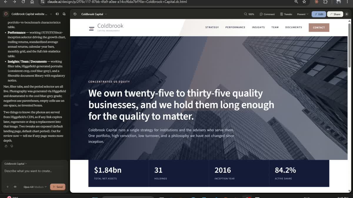
The website, described entirely in a prompt, with photography dropped into the image slots.
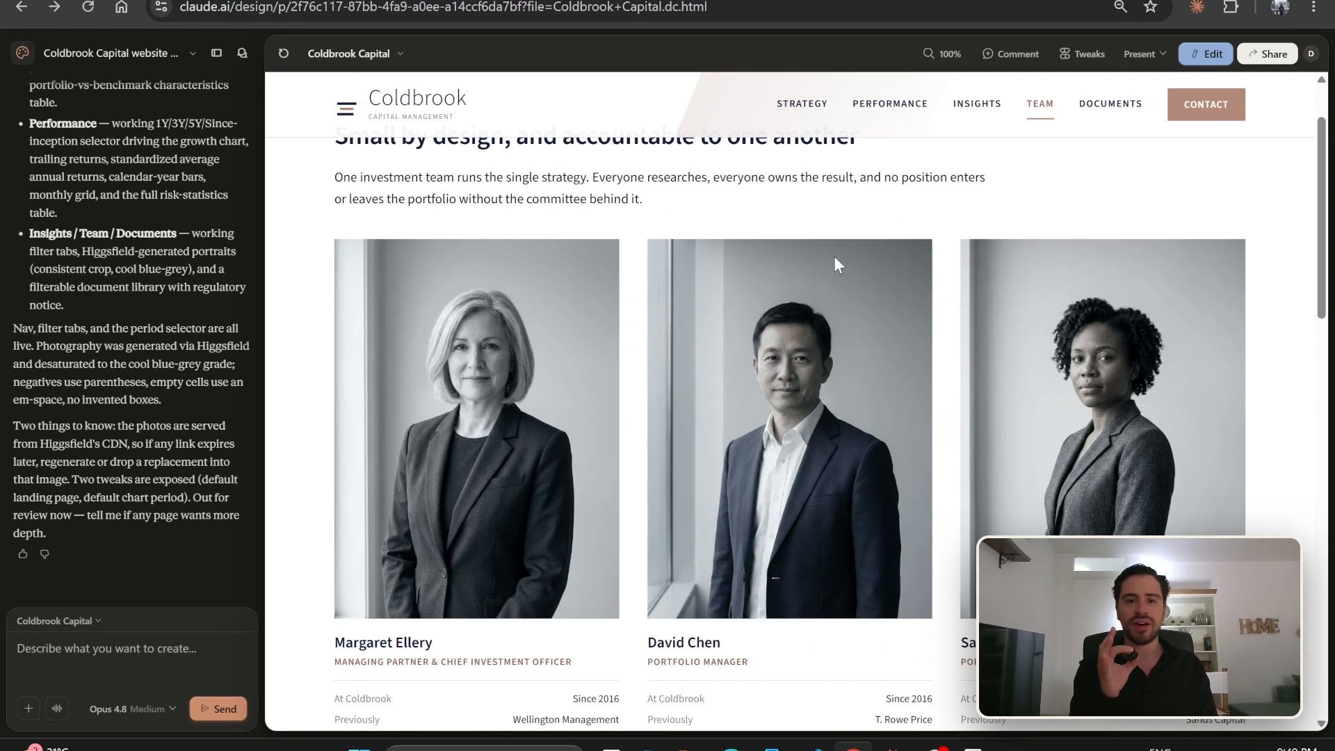
The team page, one of six. Portraits generated on brand, same crop and light for everyone.
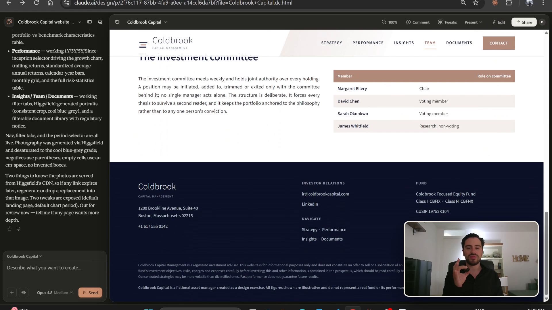
Another page, with the nav, the investment committee block and the footer, all on the same system.
The 10-page report is the centrepiece, the Brazilian fund-report format ported onto a US active equity fund. It is one prompt covering all ten pages. You can send it in a single pass, or split it into a few passes of three pages each if the model holds detail better that way, the content is identical.
Using the Coldbrook design system, build the full 10-page Coldbrook Focused Equity
Fund monthly report, June 2026. US Letter, portrait. Send it in one pass, or in passes of
three pages at a time if that holds detail better. The content is the same either way.

[paste the entity block from 05-fund-facts.md here]
[paste the loyalty rule here]

Page 1. Cover. Match the reference exactly: logo top left, fund name in navy caps top
right with the period in clay beneath, the hairline rule, then the Higgsfield cover band
directly under the header roughly 220pt tall, exactly as the reference shows. Under the
band, the OBJECTIVE section head, then the strategy in one
justified paragraph on the right and the navy stat rail down the left carrying net asset
value per share, total net assets, number of holdings, active share, turnover and
weighted holding period. Close the page with the blush fact strip across the foot in three
columns. Do not invent a hero card, a coloured panel or a title slab. The reference has a
header, a photo band, a two-column body and a fact strip, in that order, and nothing else.

Page 2. Fund Information as a two-column label and value block: inception, tickers,
CUSIP, CIK, total net assets, holdings, benchmark, adviser, distributor, administrator,
custodian, accounting firm, counsel, management fee, gross and net expense ratio,
expense limitation expiry, minimum investment, distribution frequency, fiscal year end.
Then "Month in Review": fund return, benchmark return, excess return, and three
sentences on what drove it.

Page 3. Performance. A cumulative return chart indexed to 100 against the S&P 500 since
inception, using the indexed line chart from the design system. A standardized
average annual total return table as of the most recent calendar quarter covering 1, 5
and 10 years and since inception, for both share classes and both benchmarks. A monthly
return grid, months across and years down, annual total column, benchmark row under each
year. Calendar year returns as paired bars.

Page 4. Risk and Consistency. One table with rows for annualised standard deviation,
Sharpe, Sortino, beta, alpha, R-squared, tracking error, information ratio, up capture,
down capture, batting average, percentage of positive months, best month with date,
worst month with date, and maximum drawdown with peak and trough dates. Columns for 1,
3, 5 and 10 years and since inception. Beneath it an underwater drawdown chart.

Page 5. Attribution. A diverging horizontal bar chart of contribution to return by
holding for the month, top ten and bottom five, using the diverging bar component from
the design system. Beside it a year-to-date version. Below, a sector attribution table
with allocation effect, selection effect and total, fund against the S&P 500. Two
sentences of interpretation under each.

Page 6. Positioning. Sector weights as horizontal bars, fund against benchmark, with an
active weight column. Market cap bands, fund against benchmark. Look-through revenue by
geography, meaning where the underlying companies earn revenue rather than where they are
listed. A position size histogram. A concentration block: top 10 weight, top 5 weight,
active share, number of holdings, weighted average holding period, trailing 12-month
turnover, cash.

Page 7. Portfolio Quality. A characteristics table with weighted return on invested
capital, gross margin, net debt to EBITDA, interest coverage, free cash flow yield,
three-year revenue CAGR and forward EPS growth, fund against both benchmarks. Beneath it
three small distribution charts showing the spread of ROIC, net debt to EBITDA and free
cash flow yield across the holdings, so the reader sees dispersion and not just the
average.

Page 8. Valuation and Outlook. A table of portfolio-weighted upside to fair value under
bear, base and bull scenarios, with the discount rate, terminal growth rate and steady
state margin stated for each column. Beneath it, a plain table of the five largest
positions with columns for holding, sector, weight, current price, fair value estimate and
implied upside. A table with a clay header band and hairline rows, not cards, and with no
navy stat sidebar boxed off to one side. Then a chart of the portfolio's weighted forward
P/E against its own five-year range and against the S&P 500. Two paragraphs on where
valuation sits. This page is forward-looking, so it carries an explicit assumptions
footnote and it has to be visibly honest about being an estimate.

Page 9. Holdings and Activity. A full holdings table, 25 to 35 rows, with columns for
company, ticker, sector, weight, date first purchased, market cap, contribution month to
date and contribution year to date. Then, using the description table component from the
design system, the ten largest positions in two groups titled "Core compounders" and
"Under review", each row carrying the holding name over its ticker in the grey label
column, a justified thesis in the wide column, and date first bought and weight in the two
narrow columns. Then the month's activity as a plain table with columns for date, action,
holding, resulting weight and rationale. The action word (initiated, added, trimmed,
exited) is small-caps text in its own cell, never a filled pill and never a coloured badge.

Page 10, four blocks. First, "How We Define Quality": four short sections in plain language
for someone who is not a professional investor. What a durable business looks like. Why 25
to 35 holdings rather than 100. What would make us sell. What we deliberately avoid. No
charts. Second, a glossary in two columns defining active share, batting average,
contribution to return, tracking error, information ratio, up and down capture, free cash
flow yield, return on invested capital, turnover, maximum drawdown, and standardized
performance. Third, "The Coldbrook Range": three cards for the mutual fund, the separately
managed account and the UCITS version, each with minimum, fee and availability. Fourth,
the full legal block at 6pt: the past-performance language, the current-month-end
performance line, the standardized performance note, the prospectus line, the distributor
line naming Fairmount Fund Distributors LLC as unaffiliated, the holdings-subject-to-change
line, the index line, the expense limitation line, the hypothetical performance
disclosure, and the statement that Coldbrook Capital is a fictional firm created as a
design exercise. Then contact channels: investor relations email, phone, address, LinkedIn.

Images: generate the cover band and section-divider images with Higgsfield, desaturated
cool blue grey. One full-width band before the holdings: a modern office with people
working, seen from behind or in soft focus so no individual is identifiable, natural window
light. No image sits inside a table or beside a holding.

Running header on every page with fund name and period. Footer with page number and
investor relations email. On every page carrying a return, the hypothetical-performance
footnote and the "fictional firm, design exercise" line. The attached images are reference
layouts, use them for structure, section order and information density only, do not copy
their colours, typefaces or visual style, all styling comes from the Coldbrook design
system.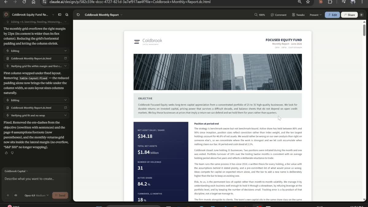
The finished report. One design system carried, unchanged, across every page.
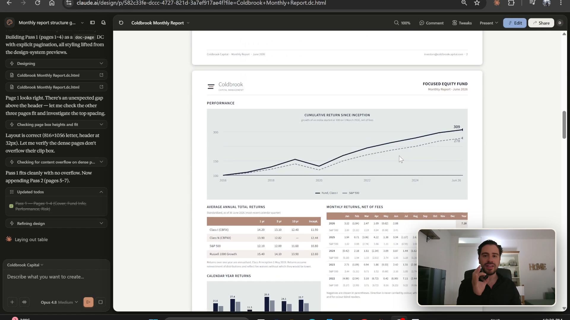
The performance page: cumulative return indexed against the S&P 500, trailing returns and calendar-year bars.
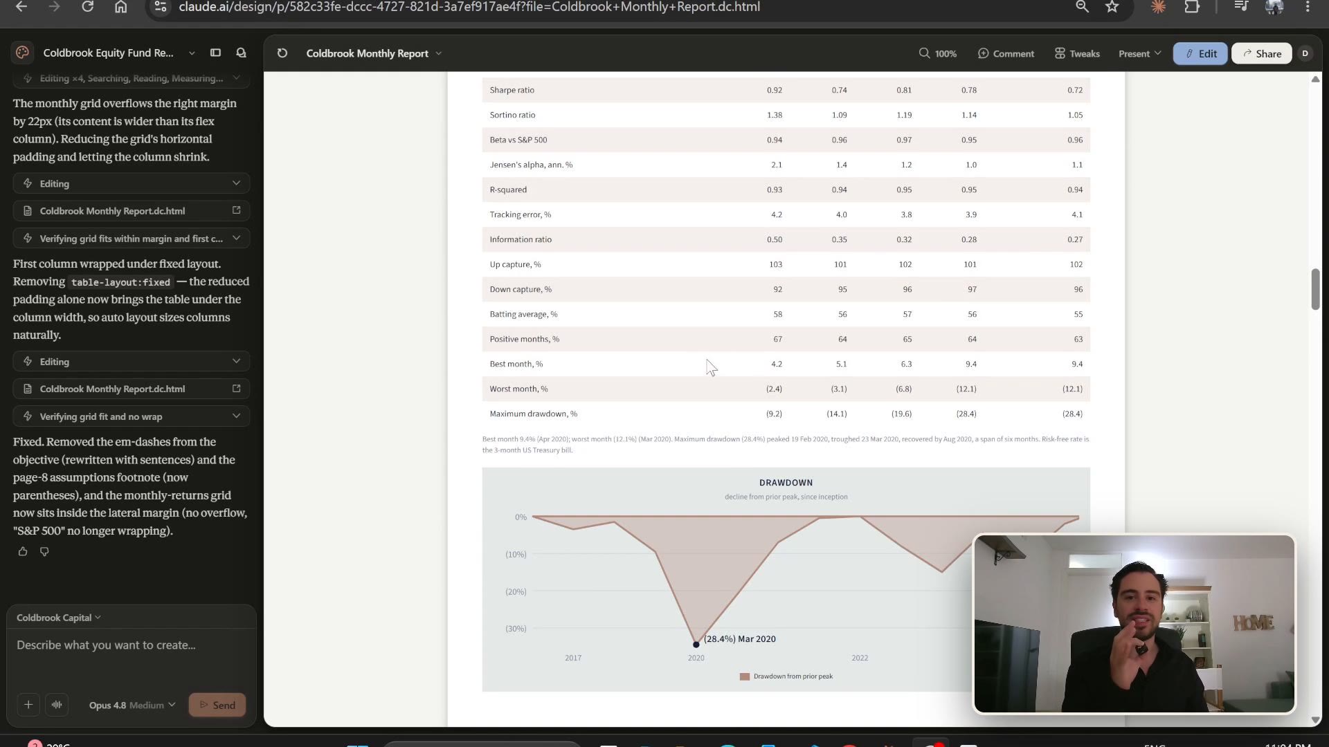
Risk and consistency: standard deviation, Sharpe, Sortino, drawdown and the rest, over each period.
The film is generated through the Higgsfield connector, which picks the right model per shot and revises against the brand as it goes. Two prompts: first the brand character so the model knows the register, then the film itself, kept entirely in the brand's cool navy and clay.
Coldbrook Capital is a US active equity manager, founded in 2016. It runs a single
concentrated strategy: 25 to 35 quality businesses, chosen for durable economics and held
for years, not quarters. Its character is restrained, disciplined and institutional, closer
to an old private bank than a fintech. Everything about it is cool, quiet and understated:
deep navy, a single muted clay accent, cold overcast light, no flash and no bright colour.
Think permanence and trust, not hype. (Fictional firm, a design exercise.)Generate a ten-second institutional brand film for Coldbrook Capital with Higgsfield.
Cinematic, restrained and quiet, in the register of a private bank, not a fintech. Strict
cool colour grade built around deep navy #0C1E48 and steel blue #24365A,
cool white, and a single restrained warm accent in dusty clay #C08878. Overcast natural
light throughout, desaturated, filmic.
Open on a slow low-angle push toward a glass office tower under an overcast sky, the facade
catching cold blue light. Cut to a calm modern boardroom in the same cool palette: two
people in tailored dark suits shake hands across a table, unhurried and genuine, a printed
report between them, shallow depth of field. Cut to a close, patient shot of hands turning
the pages of that report and a finger tracing a performance chart, the chart lines in navy
and a single clay accent. Cut to a lone analyst at a floor-to-ceiling window over a grey
city skyline, thoughtful and still. End on a clean deep-navy wall, empty and centred, held
steady for a full second with room in the middle of frame for a logo to be placed.
Camera: slow, deliberate dolly and crane moves, no handheld, no fast cuts. Mood: trust,
permanence, discipline. No smiling stock cliches, no bright colour, no on-screen text or
data noise, no real company logos anywhere. 16:9, filmic, subtle grain.The finished ten-second brand film, generated through the Higgsfield connector and resolving to the Coldbrook logo. Press play.
Everything above is the exact working version, and the whole point is that it is portable. Define your own brand once and run /design-sync, then describe the report, the site and the film, and they all inherit it. The full kit, the design system as code, the prompts, the built report and the brand film, is on GitHub: github.com/davidalmeida90/claude-design-fund. Coldbrook Capital is illustrative and not a real fund, so drop in your own name, colours and numbers and build the set for something real.
I post the models as I build them, the changes I make to them, and the results that did not work. Shorter than these write ups, and there are a lot more of them.
Follow me on X